The main difference between Teal vs. Turquoise is that teal is a darker blue-green color with a stronger green undertone, whereas turquoise is a lighter, brighter blue-green color with a stronger blue influence. Teal is often associated with sophistication, stability, and elegance, while turquoise symbolizes freshness, tranquility, tropical beauty, and creativity.
Although both colors belong to the blue-green family and are sometimes used interchangeably, they differ in hue, brightness, symbolism, color psychology, interior design applications, fashion uses, and visual impact. Understanding Teal vs. Turquoise helps designers, artists, decorators, fashion enthusiasts, and homeowners choose the right color for their projects.
Teal vs. Turquoise Comparison Table
The table below highlights the major differences between Teal vs. Turquoise.
| Feature | Teal | Turquoise |
|---|---|---|
| Color Family | Blue-green | Blue-green |
| Dominant Shade | More green | More blue |
| Brightness | Darker | Lighter |
| Saturation | Medium to deep | Bright and vibrant |
| Appearance | Rich, elegant | Fresh, lively |
| Inspiration | Teal duck feathers | Turquoise gemstone |
| Symbolism | Stability, sophistication, balance | Calmness, healing, creativity |
| Mood | Mature and calming | Cheerful and refreshing |
| Common Uses | Corporate branding, interiors, fashion | Jewelry, beach décor, summer fashion |
| Hex Code (Typical) | #008080 | #40E0D0 |
| Best Paired With | White, gold, gray, navy | Coral, white, beige, silver |
| Popularity | Professional and timeless | Vibrant and energetic |
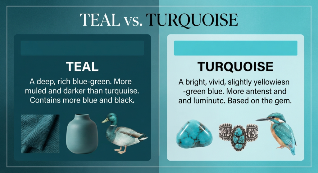
What Is Teal?
Teal is a medium to dark blue-green color named after the colorful stripe around the eyes of the common teal duck. It contains a greater proportion of green than turquoise, giving it a deeper and more subdued appearance.
Teal has become one of the most versatile colors in modern design because it balances the calming qualities of blue with the freshness of green. It is frequently used in corporate branding, luxury interiors, home décor, fashion, web design, and graphic design due to its elegant and sophisticated look.
The color is neither overly bright nor dull, making it suitable for both formal and contemporary settings. Depending on the shade, teal can appear rich, luxurious, modern, or even vintage.
Characteristics of Teal
- Dark blue-green color
- Strong green undertones
- Medium to low brightness
- Elegant and sophisticated appearance
- Associated with calmness and balance
- Creates a luxurious atmosphere
- Popular in interior decoration
- Frequently used in branding and logos
- Suitable for both modern and classic designs
- Pairs well with neutral colors and metallic accents
What Is Turquoise?
Turquoise is a bright blue-green color inspired by the natural turquoise gemstone, which has been admired for thousands of years. Compared to teal, turquoise contains more blue and appears lighter, brighter, and more vibrant.
Turquoise is widely associated with tropical oceans, clear skies, freshness, and relaxation. Because of its cheerful and energetic appearance, it is commonly used in beach-themed décor, jewelry, clothing, cosmetics, graphic design, and artistic creations.
Throughout history, turquoise has symbolized protection, healing, wisdom, and positive energy in many cultures. Its lively appearance makes it one of the most recognizable colors in design and fashion.
Characteristics of Turquoise
- Bright blue-green color
- Strong blue undertones
- High brightness
- Fresh and vibrant appearance
- Symbolizes tranquility and creativity
- Inspired by the turquoise gemstone
- Common in beach and coastal décor
- Popular in jewelry and fashion
- Creates an energetic atmosphere
- Pairs beautifully with warm neutral colors
Teal vs. Turquoise: Key Differences
1. Color Composition
The most noticeable difference between Teal vs. Turquoise lies in their color composition. Although both belong to the blue-green color family, the balance between blue and green pigments creates two visually distinct shades.
Teal contains a higher proportion of green mixed with blue, giving it a darker, richer, and more subdued appearance. Because of its stronger green undertone, teal often looks more sophisticated and less vibrant than turquoise. Depending on the lighting, it may even appear slightly grayish or deep cyan, making it suitable for elegant and professional settings.
Turquoise, on the other hand, contains more blue than green, resulting in a lighter and brighter color. It closely resembles the natural turquoise gemstone and the clear waters of tropical seas. Its vivid appearance gives it a refreshing and energetic personality that immediately attracts attention.
In simple terms, teal leans toward green, while turquoise leans toward blue, making color composition the primary distinction between the two.
2. Brightness
Brightness is another important characteristic that helps distinguish these two colors.
Teal is generally a medium-to-dark shade, meaning it absorbs more light than turquoise. This lower brightness creates a calm, refined, and luxurious appearance. Because it is less reflective, teal is often chosen for premium products, corporate branding, upscale interiors, and formal clothing.
Turquoise has significantly higher brightness. Its lighter tone reflects more light, making it appear cheerful, airy, and refreshing. This vibrant quality makes turquoise a favorite for summer fashion, beach-themed décor, travel branding, and creative designs where energy and positivity are desired.
Overall, teal creates a more subdued visual effect, whereas turquoise instantly brightens a space or design.
3. Overall Appearance
Although the two colors are closely related, their overall visual personalities are quite different.
Teal has a rich, elegant, and mature appearance. Its deeper tone conveys sophistication, confidence, and stability, making it ideal for luxury interiors, executive offices, formal fashion, and premium branding. Designers often use teal when they want to create a timeless and refined aesthetic.
Turquoise, by contrast, appears lively, youthful, and energetic. Its bright blue-green hue immediately evokes images of tropical beaches, crystal-clear lagoons, and sunny vacations. This vibrant appearance makes turquoise perfect for cheerful environments, artistic projects, and modern décor.
While teal feels calm and grounded, turquoise feels vibrant and uplifting.
4. Color Temperature
Both teal and turquoise belong to the cool color family, but they create different emotional impressions because of their varying proportions of blue and green.
Teal feels cooler and deeper due to its darker green influence. It creates a sense of calmness, stability, and quiet sophistication. This makes teal particularly suitable for environments where relaxation, concentration, or professionalism is important.
Turquoise feels cooler in a different way. Its stronger blue component gives it a crisp, refreshing quality often associated with fresh water, ocean waves, and clear skies. As a result, turquoise creates a brighter and more invigorating atmosphere.
Although both colors are considered cool tones, teal conveys depth and elegance, while turquoise conveys freshness and vitality.
5. Symbolism
Both colors carry powerful symbolic meanings, but they represent different emotions and concepts.
Teal is commonly associated with:
- Balance
- Stability
- Wisdom
- Sophistication
- Emotional healing
- Trust
- Professionalism
- Reliability
- Confidence
- Serenity
Because of these qualities, teal is frequently used by healthcare organizations, educational institutions, financial companies, and luxury brands.
Turquoise symbolizes:
- Peace
- Serenity
- Creativity
- Protection
- Happiness
- Freshness
- Positive energy
- Communication
- Spiritual healing
- Freedom
Throughout history, turquoise has been regarded as a protective color and is often linked with good fortune, renewal, and emotional well-being.
6. Psychological Effects
Color psychology shows that teal and turquoise influence emotions in different ways.
Teal promotes emotional stability, inner peace, focus, and confidence. It helps create an environment that feels secure and balanced, making it an excellent choice for offices, hospitals, libraries, conference rooms, and meditation spaces. Its calming effect can also reduce feelings of stress and anxiety.
Turquoise, in contrast, stimulates optimism, creativity, communication, and enthusiasm. It encourages self-expression and positive thinking while creating an energetic and refreshing atmosphere. Because of these qualities, turquoise is frequently used in classrooms, children’s rooms, art studios, spas, and vacation resorts.
In essence, teal supports concentration and stability, whereas turquoise inspires creativity and emotional renewal.
7. Interior Design Applications
Both colors are highly popular in interior design, but they serve different decorative purposes.
Teal works exceptionally well in:
- Living rooms
- Home offices
- Luxury bedrooms
- Accent walls
- Hotels
- Restaurants
- Executive cabins
- Libraries
- Dining rooms
- Boutique interiors
Its darker tone adds elegance, warmth, and depth to interiors. Teal also pairs beautifully with natural wood, marble, brass, and gold finishes, making spaces appear luxurious and sophisticated.
Turquoise is commonly used in:
- Bathrooms
- Beach houses
- Children’s bedrooms
- Swimming pool areas
- Coastal-themed homes
- Summer-inspired interiors
- Sunrooms
- Spa rooms
- Balconies
- Vacation homes
Its bright appearance makes rooms feel more spacious, airy, and welcoming. Turquoise is especially effective in interiors designed around coastal, tropical, or Mediterranean themes.
8. Fashion Uses
Fashion designers frequently use both teal and turquoise, but each color creates a different style statement.
Teal is a popular choice for:
- Business suits
- Evening gowns
- Formal dresses
- Luxury handbags
- Winter clothing
- Office wear
- Blazers
- Designer accessories
- Silk scarves
- High-end footwear
Because of its rich appearance, teal is often associated with elegance, confidence, and timeless fashion.
Turquoise is commonly seen in:
- Summer dresses
- Swimwear
- Casual shirts
- Jewelry
- Resort fashion
- Vacation outfits
- Beach accessories
- Sandals
- Bohemian clothing
- Festival wear
Its bright and cheerful appearance makes turquoise especially suitable for warm-weather fashion and casual styling.
9. Popular Color Combinations
The colors paired with teal and turquoise can dramatically influence their visual appeal.
Teal pairs beautifully with:
- White
- Gold
- Gray
- Navy
- Black
- Cream
- Mustard
- Copper
- Burgundy
- Charcoal
These combinations create elegant, luxurious, and modern color palettes suitable for homes, branding, and formal fashion.
Turquoise combines well with:
- Coral
- Beige
- White
- Silver
- Sand
- Peach
- Brown
- Yellow
- Aqua
- Light gray
These pairings produce bright, tropical, cheerful, and contemporary designs commonly seen in summer collections and coastal interiors.
10. Best Uses
Choosing between Teal vs. Turquoise depends on the atmosphere, mood, and purpose of your design project.
Choose teal when you want:
- Elegant interiors
- Professional branding
- Luxury aesthetics
- Formal fashion
- Rich accent colors
- Premium product packaging
- Corporate presentations
- Executive office décor
- Timeless home decoration
- Sophisticated website designs
Choose turquoise when you want:
- Bright décor
- Tropical themes
- Creative branding
- Beach-inspired fashion
- Energetic visual appeal
- Children’s room decoration
- Summer marketing campaigns
- Spa or wellness environments
- Artistic projects
- Fresh and vibrant digital designs
Ultimately, teal is the better choice for sophistication and elegance, while turquoise excels in creating cheerful, refreshing, and energetic designs. Selecting the right color depends on the mood and visual impact you want to achieve.
Similarities Between Teal and Turquoise
Although Teal and Turquoise are different shades of blue-green, they share many similarities. Both colors combine blue and green pigments, belong to the cool color family, and are widely used in fashion, interior design, graphic design, branding, and art. They evoke feelings of calmness, freshness, and balance, making them popular choices for both personal and professional applications.
Some key similarities between teal and turquoise include:
- Both belong to the blue-green color spectrum.
- Both are considered cool colors.
- Both create a calming and refreshing atmosphere.
- Both are widely used in home décor and interior design.
- Both are popular in fashion and accessories.
- Both pair well with neutral colors like white, gray, and beige.
- Both are commonly used in digital and graphic design.
- Both symbolize nature, water, and tranquility.
- Both complement metallic finishes such as silver and gold.
- Both are timeless colors suitable for modern and traditional styles.
Advantages of Teal
Teal is admired for its versatility and elegant appearance. It combines the calming qualities of blue with the natural freshness of green, making it suitable for a wide range of design applications.
Some major advantages of teal include:
- Creates a sophisticated and luxurious appearance.
- Suitable for professional and corporate branding.
- Adds depth and richness to interior spaces.
- Works well with both modern and traditional décor.
- Promotes calmness and emotional balance.
- Easy to combine with neutral and metallic colors.
- Popular in luxury fashion and accessories.
- Less likely to go out of style because of its timeless appeal.
- Suitable for both residential and commercial spaces.
- Creates a premium visual impression.
Advantages of Turquoise
Turquoise is valued for its bright, energetic, and refreshing appearance. It instantly adds vibrancy to a design and is often associated with tropical beauty and creativity.
Some major advantages of turquoise include:
- Creates a bright and cheerful atmosphere.
- Makes rooms appear larger and more open.
- Ideal for coastal and tropical décor.
- Encourages creativity and positive thinking.
- Highly attractive in jewelry and fashion.
- Popular for summer-themed designs.
- Pairs beautifully with warm neutral colors.
- Enhances beach-inspired interiors.
- Provides a youthful and energetic appearance.
- Suitable for creative branding and artistic projects.
Which Color Is Better—Teal or Turquoise?
Neither teal nor turquoise is universally better because each serves a different purpose. The right choice depends on the mood, environment, and style you want to create.
Teal is the better option if you prefer a rich, elegant, and sophisticated look. Its darker blue-green tone works exceptionally well in luxury interiors, professional branding, formal clothing, and modern home décor. Designers often choose teal when they want to create a calm, balanced, and refined atmosphere.
Turquoise, on the other hand, is ideal if you want a bright, vibrant, and energetic appearance. Its lighter blue-green shade creates a fresh and welcoming environment, making it perfect for coastal interiors, summer fashion, creative branding, and tropical-inspired spaces.
Choose Teal if you want:
- Elegant home interiors
- Corporate branding
- Luxury designs
- Formal clothing
- Rich accent walls
- Premium product packaging
- Modern office spaces
- Timeless color schemes
Choose Turquoise if you want:
- Beach-themed décor
- Bright living spaces
- Summer fashion
- Creative artwork
- Resort-style interiors
- Vibrant websites
- Children’s rooms
- Tropical color palettes
Both colors are visually appealing and highly versatile. Your final choice depends on whether you prefer the depth and sophistication of teal or the brightness and freshness of turquoise.
Conclusion
The comparison of Teal vs. Turquoise shows that although both colors belong to the blue-green family, they differ significantly in tone, brightness, symbolism, and practical applications. Teal is a deeper, darker shade with stronger green undertones, making it ideal for elegant interiors, luxury branding, and professional settings. It conveys sophistication, stability, and emotional balance.
Turquoise, in contrast, is a brighter and lighter blue-green shade with stronger blue undertones. It is associated with tropical waters, creativity, freshness, and positive energy. Its vibrant appearance makes it a favorite for beach-inspired décor, summer fashion, jewelry, and artistic designs.
Understanding Teal vs. Turquoise helps homeowners, designers, artists, and fashion enthusiasts select the right color for their projects. If you want a refined and timeless look, teal is an excellent choice. If you prefer a lively, cheerful, and refreshing atmosphere, turquoise is the better option.
Frequently Asked Questions (FAQs)
The main difference between Teal vs. Turquoise is that teal is a darker blue-green color with stronger green undertones, whereas turquoise is a lighter and brighter blue-green color with stronger blue undertones.
Yes. Teal is generally darker and more muted than turquoise. Its deeper tone gives it a sophisticated and elegant appearance, while turquoise looks brighter and more vibrant.
Turquoise typically contains more blue than green, which gives it its bright, refreshing appearance. However, the exact shade can vary depending on the specific color palette or design standard.
Both colors work well in interiors but serve different purposes. Teal is better for creating elegant, luxurious, and cozy spaces, while turquoise is ideal for bright, coastal, tropical, and airy interiors.
Yes. Teal and turquoise complement each other beautifully because they belong to the same color family. Combining them creates depth, contrast, and a balanced color palette suitable for home décor, fashion, and graphic design.
Read Next: